I recently tweeted an animated GIF that depicted the yearly variation in efficacy of tebuconazole, a DMI fungicide, evaluated in field trials, for the control of soybean rust in a major soybean region of Brazil (Mato Grosso state).
This is what happens when one fungicide (DMI in this case) is massively used over many years in a large soybean-growing region. Life finds a way. Showed this in my talk this AM "To spray or not to spray". pic.twitter.com/uFf6VbSieb
— Emerson Del Ponte (@edelponte) May 23, 2019
The Asian rust is the most damaging disease of soybean in Brazil since it was discovered in 2004, for which no other method than fungicides is available for effective control. The Tweet got a lot of attention, not only because of the important issue, but I think also because of the nice way to visualize the data. So I decided to share the R code use to produce the animation for others’ presentations.
The data used here are from a more complete set obtained from a meta-regression study where the effect of year was tested as moderator variable (Dalla Lana et al. 2018). The data of that study have been made available (Del Ponte et al.2017), which makes it possible to reuse them!
We will start by importing, inspecting and preparing the data for visualization. I like the tidyverse tools and programming style, so this package is essentially the first to load.
The data are available in one of my OSF project as an csv file.
In the files panel, look for the sev_data.csv file within the data subfolder.
Let’s import the web-hosted file into R using read_csv function.
You need an Internet connection, and you may want to save the data frame locally.
    library(tidyverse)
    fungicide <- read_csv("https://osf.io/rp7nb/download")
Data inspection
Let’s see how many treatments and the number of entries per treatment.
These are the different levels of the active_ingredient column, including the non-treated check. I like to use the tabyl() function of the {janitor} package as substitute for table(), so you can do the same using the latter base function if you prefer.
    library(janitor)

    ##
    ## Attaching package: 'janitor'

    ## The following objects are masked from 'package:stats':
    ##
    ##     chisq.test, fisher.test

    fungicide %>%
      tabyl(active_ingredient) %>%
      arrange(-n)

    ##   active_ingredient   n    percent
    ## 1             check 250 0.17385257
    ## 2              tebu 248 0.17246175
    ## 3         azox_cypr 212 0.14742698
    ## 4         pyra_epox 154 0.10709318
    ## 5              cypr 146 0.10152990
    ## 6         pico_cypr 144 0.10013908
    ## 7         trif_prot 109 0.07579972
    ## 8         pyra_metc  96 0.06675939
    ## 9              azox  79 0.05493741
And now we can make a pivot table for active ingredient versus year to check those used for longer time and lower gaps. The values represent the number of trials where the fungicide was evaluated within a specific year.
    fungicide %>%
      tabyl(active_ingredient, year) %>%
      arrange(active_ingredient)

    ##   active_ingredient 2005 2006 2007 2008 2009 2010 2011 2012 2013 2014
    ## 1              azox    0    0   19    0    0    0    0   17   23   20
    ## 2         azox_cypr   19    0   20   11   53   28   21   17   23   20
    ## 3             check   19   19   39   11   53   28   21   17   23   20
    ## 4              cypr    0   18   19    0    0   28   21   17   23   20
    ## 5         pico_cypr    0    0    0   11   25   28   21   17   22   20
    ## 6         pyra_epox    0    0   20    0   25   28   21   17   23   20
    ## 7         pyra_metc    0    0    0    0   28   27   21    0    0   20
    ## 8              tebu   19   19   37   11   53   28   21   17   23   20
    ## 9         trif_prot    0    0    0    0   28    0   21   17   23   20
Besides the non-treated check with the largest sample size (250 independent experiments), the fungicides evaluated in most years were tebu and azox+cypro, or eight years (2007 to 2014).
We will need the check treatment as well.
I like to subset the data using the filter() function so we keep only the relevant data to work further.
Data preparation
    tebu_mix <- fungicide %>%
      filter(active_ingredient %in% c("check", "tebu", "azox_cypr")) %>%
      arrange(trial) # ordered by trial
The trials were conducted at several states in Brazil. Let’s see how many trials per state and year.
    fungicide %>%
      tabyl(state, year)

    ##  state 2005 2006 2007 2008 2009 2010 2011 2012 2013 2014
    ##     BA    3    3    6    8    0    7    0    0    0    0
    ##     DF    3    0    8    0   10    0    8   16    8    9
    ##     GO    9   12   24    4   40   42   24   32   40   54
    ##     MA    3    0    8    0    0    0    0    0    0    0
    ##     MG    3    3    8    4   10    7    0    0    0    0
    ##     MS    6    9   36    8   45   20   16    8   24    9
    ##     MT    3    3    8    0   80   21   32   24   32   45
    ##     PR   12   14   32   16   30   42   32   24   48   36
    ##     RS    0    3    0    4   25   35   32    8   16    9
    ##     SC    0    0    0    0    0    7   16    8    0    0
    ##     SP   15    9   16    0   25   14    8   16   15   18
    ##     TO    0    0    8    0    0    0    0    0    0    0
I want to eliminate states from our analysis with too many gaps in the years and group states by climatic region or geographical proximity. I split all six remaining states into three groups as follows.
    tebu_mix1 <- tebu_mix %>%
      filter(!state %in% c("SC", "TO", "MA", "MG", "BA", "DF")) %>%
      mutate(region = case_when(
        state %in% c("MT", "GO") ~ "MT+GO",
        state %in% c("SP", "MS") ~ "SP+MS",
        state %in% c("PR", "RS") ~ "PR+RS"
      ))
Now we need to create our variable of interest, or the percent reduction in disease severity relative to the non-treated check, commonly referred to control efficacy.
This can be done by first reshaping data to the wide format using the spread() function.
Then, with the three response variables in separate columns, we can create the new variable of interest using the mutate() function.
The efficacy is obtained from the ratio of fungicide-treated and non-treated subtracted from one.
Hence, the larger the efficacy (zero to 100%), the better is the fungicide.
Note that selection() was used to preserve only the columns that are relevant.
Also note that negative values can be calculated in rare situations where disease severity in the fungicide-treated plot is
higher than in the non-treated check of the same experiment.
    tebu_mix2 <- tebu_mix1 %>%
      select(trial, year, state, region, active_ingredient, severity) %>%
      spread(active_ingredient, severity) %>%
      mutate(
        tebu_eff = 100 - (tebu / check * 100),
        azox_cypr_eff = 100 - (azox_cypr / check * 100)
      ) %>%
      select(1:4, 8:9)
    head(tebu_mix2)

    ## # A tibble: 6 x 6
    ##   trial  year state region tebu_eff azox_cypr_eff
    ##   <dbl> <dbl> <chr> <chr>     <dbl>         <dbl>
    ## 1     2  2005 PR    PR+RS      96.5          98.1
    ## 2     4  2005 MS    SP+MS      94            90
    ## 3     5  2005 MT    MT+GO      97.1          95.9
    ## 4     6  2005 GO    MT+GO      62.3          43.0
    ## 5     7  2005 GO    MT+GO      99.0          99.0
    ## 6     8  2005 PR    PR+RS      98.7          98.7
Data visualization
Now that our data set is ready, let’s make a static plot just for quick visualization.
First we want to reshape the data back to the long format using gather() for producing side by side plots by another variable
using facet_wrap().
    # reorder levels of the region factor
    tebu_mix2$region2 <- factor(tebu_mix2$region, levels = c("MT+GO", "SP+MS", "PR+RS"))

    tebu_mix2 %>%
      select(year, region2, state, tebu_eff, azox_cypr_eff) %>%
      gather(key = treatment, value = efficacy, -c(1:3)) %>%
      ggplot(aes(year, efficacy, color = region2)) +
      geom_jitter(width = 0.2, alpha = 0.7) +
      facet_grid(region2 ~ treatment) +
      theme_grey() +
      theme(legend.position = "top") +
      labs(x = "Harvest year", y = "Percent disease reduction", color = "Region")

    ## Warning: Removed 32 rows containing missing values (geom_point).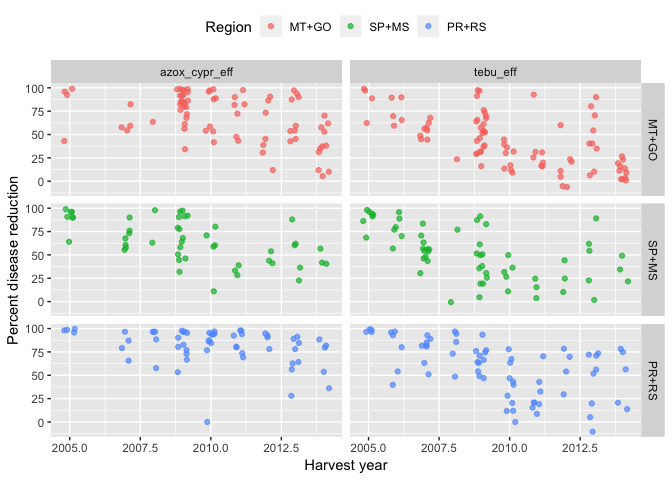
gganimate plots
Now the fun plots! We will use the {gganimate} package to produce a GIF animation.
There is no trouble here as we just need to add year variable in the transition_time() function.
Further details in official package documentation.
I learnt that in my example year should be transformed to an integer to prevent it from displaying several decimal places.
Three other functions I found interesting to add to the animation (see after transition_time*(), ease_aes(), exit_fade() and shadow_trail()).
More tricks on using {gganimate} can be found here.
library(gganimate)

tebu_decline <- tebu_mix2 %>%
  select(year, region2, tebu_eff, azox_cypr_eff) %>%
  gather(key = treatment, value = efficacy, -c(1:2)) %>%
  filter(efficacy > 0)

tebu_anima <- tebu_decline %>%
  ggplot(aes(year, efficacy, color = region2)) +
  geom_jitter(size = 3,
              alpha = 0.5) +
  scale_x_continuous(breaks = c(2005, 2006, 2007, 2008, 2009, 2010, 2011, 2012, 2013, 2014, 2015)) +
  transition_time(as.integer(year)) +
  ease_aes("linear") +
  exit_fade() +
  shadow_trail(max_frames = 7) +
  labs(
    title = "Efficacy ot fungicides for soybean rust control",
    subtitle = "Each dot is one experiment. Year: {frame_time}",
    x = "Harvest year",
    y = "Disease reduction relative to non-treated (%)",
    caption = "Source: Dalla Lana (2018)",
    color = "States"
  ) +
  theme_minimal() +
  theme(legend.position = "right") +
  facet_grid(region2 ~ treatment)
animate(tebu_anima, width = 600, height = 500)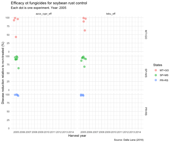
This is it! Don’t forget to save this current animation to GIF using:
anim_save("tebuconazole-decline.gif", last_animation())