Objectives
There are two types of models described in the paper, the first model is a linear model used to describe the unplanted control and two quadratic models fit Gatcher (Susceptible) and GS50a (Moderately Resistant) wheat cultivars. For a more detailed discussion on fitting plant disease models in R, please see the “Linear Regression” module in the “Ecology and Epidemiology in R” documents available in the American Phytopathological Society’s (APS) Education Center. For an even more in-depth discussion on linear models in R, how to fit and how to interpret the diagnostics that R provides the reader should refer to Faraway (2002).
This post will illustrate how to fit the original linear and quadratic models using the original data in R (R Core Team 2017).
Packages
Using the {tidyverse}, (2017) package simplifies the libraries used in this work. It is a collection of packages designed to work together for data science, https://www.tidyverse.org/. The {tidyverse} includes, {readr} (2017b), used to import the data; {tidyr} (2018), used to format the data; {dplyr} (2017a), used to subset the data; and {ggplot2} (2016), used for visualising the data and model fits. {viridis} (2018) is a selection of colour pallets that are widely accessible for people with colour-blindness and printing in black and white.
The following code chunk checks first to see if you have{tidyverse} and {viridis} installed, if not, it will automatically install them and then load them.
if (!require("tidyverse")) {
  install.packages("tidyverse",
                   repos = c(CRAN = "https://cloud.r-project.org/"))
  library("tidyverse")
}

if (!require("viridis")) {
  install.packages("viridis",
                   repos = c(CRAN = "https://cloud.r-project.org/"))
  library("viridis")
}
Data Wrangling
The data are located in the data sub-folder.
Import the data using read_csv() function from {readr} and view them.
nema <- read_csv("data/Nematode_Data.csv")

nema
# A tibble: 24 × 9
Weeks Days Temperature Degree_days Unplanted Gatcher GS50a Potam
<dbl> <dbl> <dbl> <dbl> <dbl> <dbl> <dbl> <dbl>
1 8 56 15 280 5.75 6.77 6.69 7.61
2 8 56 20 560 5.92 9.51 7.42 9.28
3 8 56 22.5 700 6.38 9.96 8.21 9.02
4 8 56 25 840 6.51 9.35 8.25 9.73
5 10 70 15 350 5.85 7.44 6.04 5.97
6 10 70 20 700 6.16 10.3 8.91 10.3
7 10 70 22.5 875 6.19 10.4 9.18 10.7
8 10 70 25 1050 6.36 10.6 9.04 10.5
9 12 84 15 420 5.76 9.93 8.19 8.74
10 12 84 20 840 6.98 11.7 9.85 11.3
# ℹ 14 more rows
# ℹ 1 more variable: Suneca <dbl>nrow(nema)[1] 24Description of Fields in the Data
There are nine columns in the nema data described here in the following table.
| Field | Data Description |
|---|---|
| Weeks | Number of weeks after wheat sowing |
| Days | Number of days after wheat sowing |
| Temperature | Temperature (°C) treatment |
| Degree_Days | Average thermal time degree days above 10 °C for four soil depths (8, 15, 30 and 60 cm) |
| Unplanted |
Log*, log(), nematode population in
the control treatment with no wheat planted
|
| Gatcher |
Log*, log(), nematode population in a
susceptible wheat cultivar
|
| GS50a |
Log*, log(), nematode population in a
moderately resistant wheat cultivar
|
| Potam |
Log*, log(), nematode population in a
susceptible wheat cultivar
|
| Suneca |
Log*, log(), nematode population in a
susceptible wheat cultivar
|
* For an exploration into the reasons why the data were transformed using the natural log log(), see the Exploring Why the Data Were Log Transformed in the Bonus Material section
|
Wide to Long Data
You can see that each of the varieties have their own column in the original data format, this is commonly called wide data. Wide data are commonly found in spreadsheets but do not lend themselves easily to data analysis, modelling and visualisation. To make it easier to do these things it is common to convert the data from wide to long format, commonly referred to as tidying, when using R. The advantage of a tidy data set is that it is easy to manipulate, model and visualize, and always has a specific structure where each variable is a column, each observation is a row, and each type of observational unit is a table (Wickham 2014).
In order to use {ggplot2} for visualising the data, they need to be converted from wide to long.
Using pivot_longer() from the {tidyr} package to convert from wide to long format where the varieties are all listed in a single column, Variety.
nema_long <- nema %>%
  pivot_longer(cols = Unplanted:Suneca,
               names_to = "Variety",
               values_to = "Log_pop")

nema_long
# A tibble: 120 × 6
Weeks Days Temperature Degree_days Variety Log_pop
<dbl> <dbl> <dbl> <dbl> <chr> <dbl>
1 8 56 15 280 Unplanted 5.75
2 8 56 15 280 Gatcher 6.77
3 8 56 15 280 GS50a 6.69
4 8 56 15 280 Potam 7.61
5 8 56 15 280 Suneca 6.70
6 8 56 20 560 Unplanted 5.92
7 8 56 20 560 Gatcher 9.51
8 8 56 20 560 GS50a 7.42
9 8 56 20 560 Potam 9.28
10 8 56 20 560 Suneca 9.12
# ℹ 110 more rowsnrow(nema_long)[1] 120As we see, the original nema data had only 24 rows and the long format of the data have 120 rows now.
Data Visualisation
Now that the data are in the format that {ggplot2} uses, take a look at the data first to see what it looks like. Here we fit a smoothed line for each variety’s nematode population to the raw data. The individual temperature treatments are shown here by shape, the variety by colour.
ggplot(nema_long,
       aes(
         x = Degree_days,
         y = Log_pop,
         colour = Temperature,
         group = Variety
       )) +
  geom_point(size = 3.5) +
  geom_smooth(colour = "grey",
              se = FALSE,
              alpha = 0.5) +
  ylab(expression(paste("ln(",
                        italic("P. thornei"),
                        "/kg soil) + 1"),
                  sep = "")) +
  xlab("Thermal Time (°C Days Above 10°C)") +
  theme_light() +
  theme(legend.position = "top") +
  guides(color = guide_colorbar(
    title.position = "top",
    title.hjust = .5,
    barwidth = unit(20, "lines"),
    barheight = unit(0.5, "lines")
  )) +
  scale_colour_viridis("Temperature (°C)") +
  coord_cartesian(clip = "off",
                  expand = FALSE) +
  facet_wrap( ~ Variety, ncol = 2)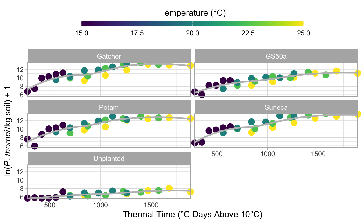
Modelling
Unplanted Model
The paper uses a linear model for the unplanted control.
Here we will write a function to use in modelling the unplanted population data.
I have wrapped the model in a function which makes it pipe-able, %>% and has other advantages
when it comes to fitting the same model to several sets of data.
In the linear equation for the Unplanted control treatment, the rate of population increase can be expressed as:
\[y = y_0 + rt\]
Where \(y_0\) is the initial population, \(r\) is the rate of change and \(t\) equal time.
Fitting a Linear Model
linear_model <- function(df) {
  lm(Log_pop ~ Degree_days,
     data = df)
}
Now check the model fit, using filter() from {dplyr} to select only Unplanted data from the data set for the model and fit the linear model to the data.
Using par(mfrow = c(2, 2)) creates a four-panel graph rather than four individual graphs, which the next function will create by default when using R base graphics.
If you want to arrange {ggplot2} graphs, see A multi panel figure for coffee leaf rust for examples of this.
Using the plot() function with any lm() object will create four diagnostic plots for your inspection.
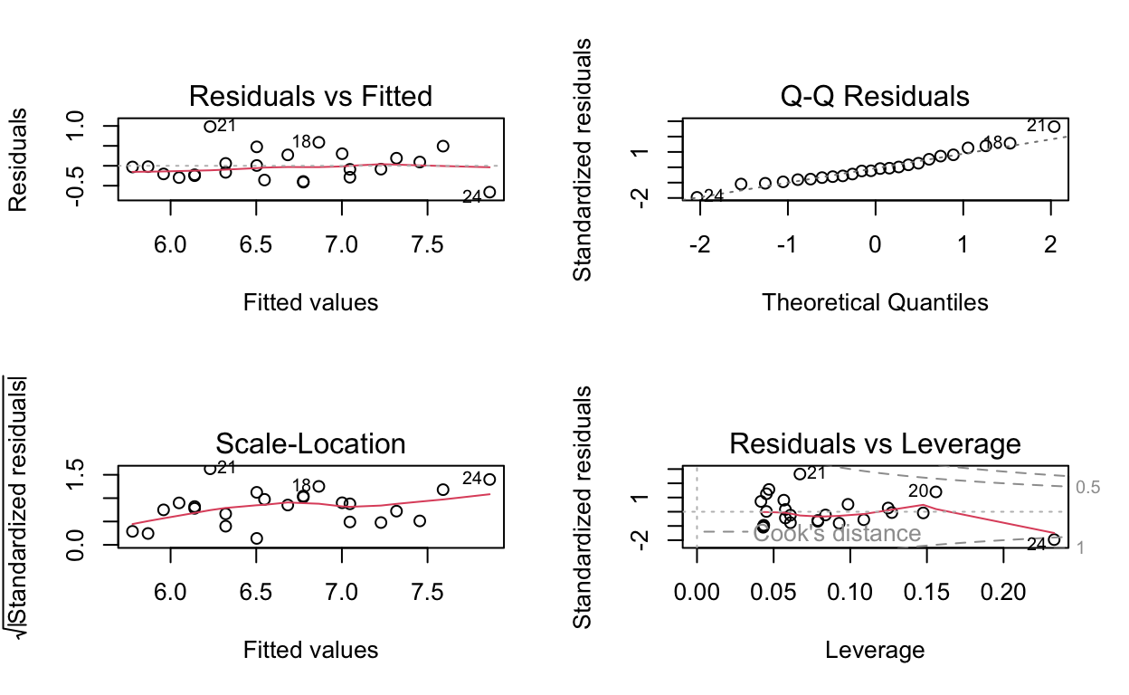
These plots do not appear to indicate anything amiss as one would hope for from the models that have already been published. If you are unfamiliar with how to interpret these diagnostic plots see Interpreting Linear Models in R in the Further Reading section.
Using the summary() function displays information about the model fit.
If you are unfamiliar with how to read and interpret the output of summary() for a linear model, please refer to Interpreting Linear Models in R in the Further Reading section for references that go into more detail on this matter.
summary(unplanted_model)
Call:
lm(formula = Log_pop ~ Degree_days, data = df)

Residuals:
     Min       1Q   Median       3Q      Max
-0.66053 -0.25811 -0.05683  0.21123  0.98511

Coefficients:
             Estimate Std. Error t value             Pr(>|t|)
(Intercept) 5.4150643  0.1929731  28.061 < 0.0000000000000002 ***
Degree_days 0.0012950  0.0001823   7.103          0.000000401 ***
---
Signif. codes:  0 '***' 0.001 '**' 0.01 '*' 0.05 '.' 0.1 ' ' 1

Residual standard error: 0.3847 on 22 degrees of freedom
Multiple R-squared:  0.6964,    Adjusted R-squared:  0.6826
F-statistic: 50.45 on 1 and 22 DF,  p-value: 0.0000004006
From the original paper, the \(R^2\) value of the Unplanted linear model was 0.7, we can see here that agrees: 0.7. In the original paper, \(P\) < 0.001, R reports \(p-value:\) 0.0000004, which also agrees.
Visualising the Model Fit to the Data
Using {ggplot2}’s geom_smooth() we can fit the same model above and graph the resulting line.
nema_long %>%
  group_by(Variety) %>%
  filter(Variety == "Unplanted") %>%
  ggplot(aes(x = Degree_days,
             y = Log_pop,
             colour = Temperature)) +
  geom_point(size = 3.5) +
  geom_smooth(
    method = "lm",
    formula = y ~ x,
    size = 1,
    se = FALSE,
    colour = "grey",
    alpha = 0.5
  ) +
  ylab(expression(paste("ln(",
                        italic("P. thornei"),
                        "/kg soil) + 1"),
                  sep = "")) +
  xlab("Thermal Time (°C Days Above 10°C)") +
  theme_light() +
  theme(legend.position = "top") +
  guides(color = guide_colorbar(
    title.position = "top",
    title.hjust = 0.5,
    barwidth = unit(20, "lines"),
    barheight = unit(0.5, "lines")
  )) +
  scale_colour_viridis("Temperature (°C)") +
  coord_cartesian(clip = "off",
                  expand = FALSE) +
  ggtitle("Unplanted Linear Model")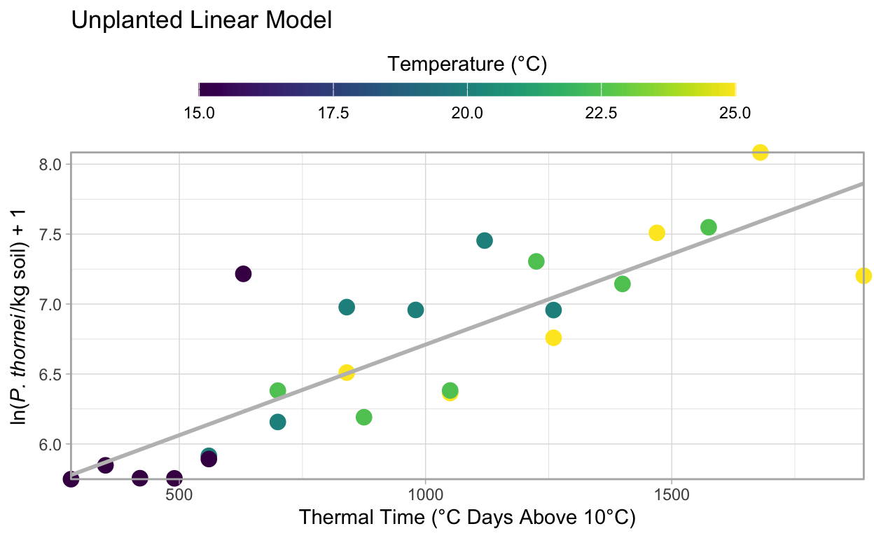
Quadratic Models
In the original paper, the quadratic model best described Gatcher and GS50a data, which are fit here.
Susceptible Varieties
Gatcher, Potam and Suneca all have very similar curves, here Gatcher is used to fit a quadratic model as in the original paper following the same methods as above for the linear model.
s_model <- nema_long %>%
  filter(Variety == "Gatcher") %>%
  quadratic_model()

par(mfrow = c(2, 2))
plot(s_model)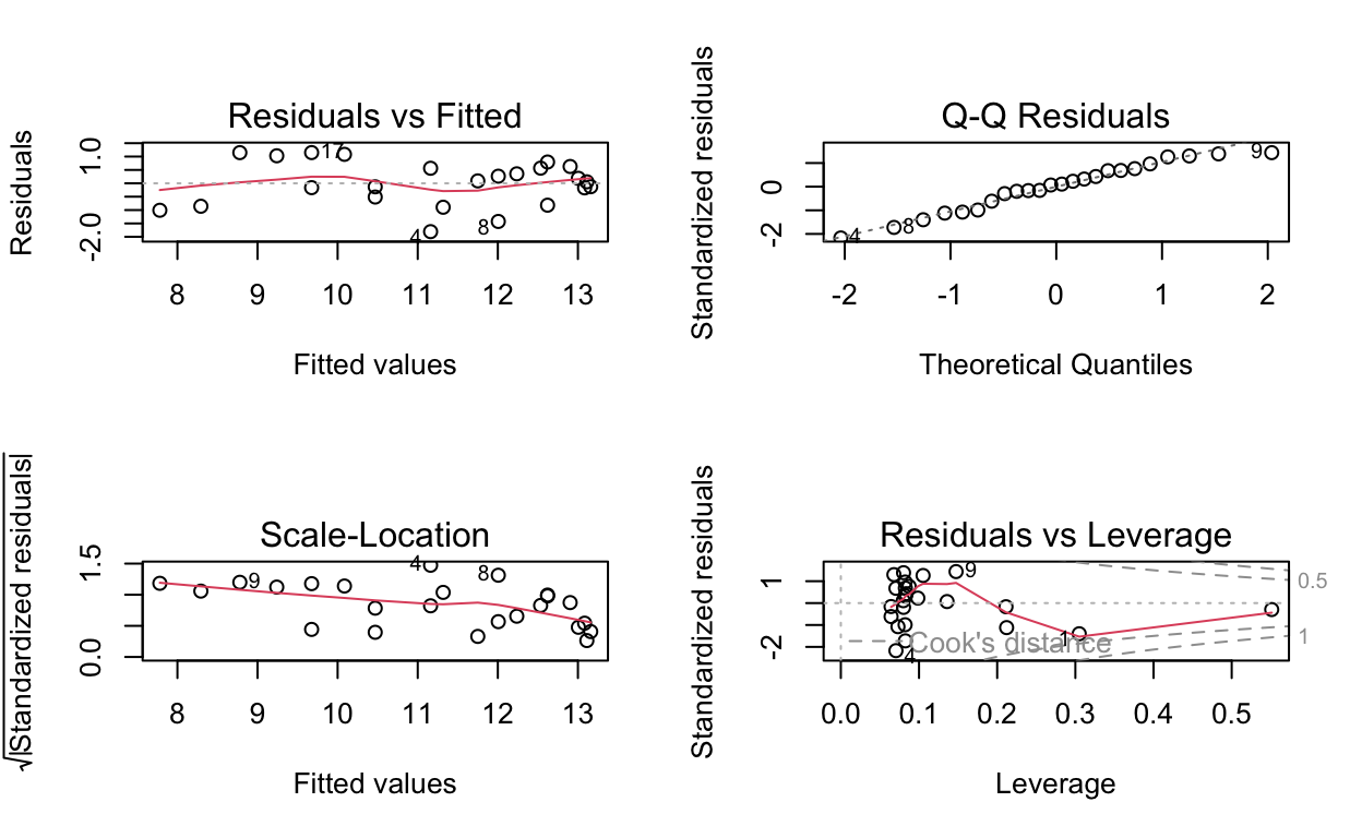
summary(s_model)
Call:
lm(formula = Log_pop ~ Degree_days + I(Degree_days^2), data = df)

Residuals:
     Min       1Q   Median       3Q      Max
-1.80668 -0.58936  0.07297  0.58228  1.14866

Coefficients:
                      Estimate    Std. Error t value   Pr(>|t|)
(Intercept)       5.4761040479  0.9043328406   6.055 0.00000521 ***
Degree_days       0.0089612116  0.0019093749   4.693   0.000124 ***
I(Degree_days^2) -0.0000026117  0.0000009008  -2.899   0.008579 **
---
Signif. codes:  0 '***' 0.001 '**' 0.01 '*' 0.05 '.' 0.1 ' ' 1

Residual standard error: 0.8631 on 21 degrees of freedom
Multiple R-squared:  0.7998,    Adjusted R-squared:  0.7808
F-statistic: 41.96 on 2 and 21 DF,  p-value: 0.00000004621
From the original paper, the \(R^2\) value of Gatcher’s quadratic model was 0.80, we can see here that agrees: 0.8. In the original paper, \(P\) < 0.001, R reports \(p-value:\) 0.000124, which also agrees.
Visualise Susceptible Variety Model
The model visualisation is the same for the quadratic models as the linear model, however you will note that the line has a downward curve at higher temperatures.
nema_long %>%
  group_by(Variety) %>%
  filter(Variety == "Gatcher") %>%
  ggplot(aes(x = Degree_days,
             y = Log_pop,
             colour = Temperature,)) +
  geom_point(size = 3.5) +
  geom_smooth(
    method = "lm",
    formula = y ~ x + I(x ^ 2),
    size = 1,
    se = FALSE,
    colour = "grey",
    alpha = 0.5
  ) +
  ylab(expression(paste("ln(",
                        italic("P. thornei"),
                        "/kg soil) + 1"),
                  sep = "")) +
  xlab("Thermal Time (°C Days Above 10°C)") +
  theme_light() +
  theme(legend.position = "top") +
  guides(color = guide_colorbar(
    title.position = "top",
    title.hjust = .5,
    barwidth = unit(20, "lines"),
    barheight = unit(0.5, "lines")
  )) +
  scale_colour_viridis("Temperature (°C)") +
  coord_cartesian(clip = "off",
                  expand = FALSE) +
  ggtitle("Gatcher Quadratic Model")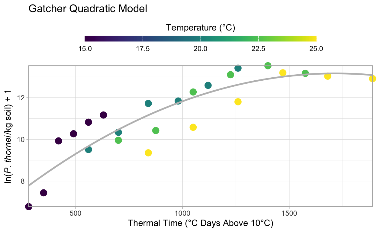
Moderately Resistant Cultiver
GS50a, moderately resistant to P. thornei, also fits a quadratic model but the coefficients are slightly different due to different responses to the variety and temperature.
mr_model <- nema_long %>%
  filter(Variety == "GS50a") %>%
  quadratic_model()

par(mfrow = c(2, 2))
plot(mr_model)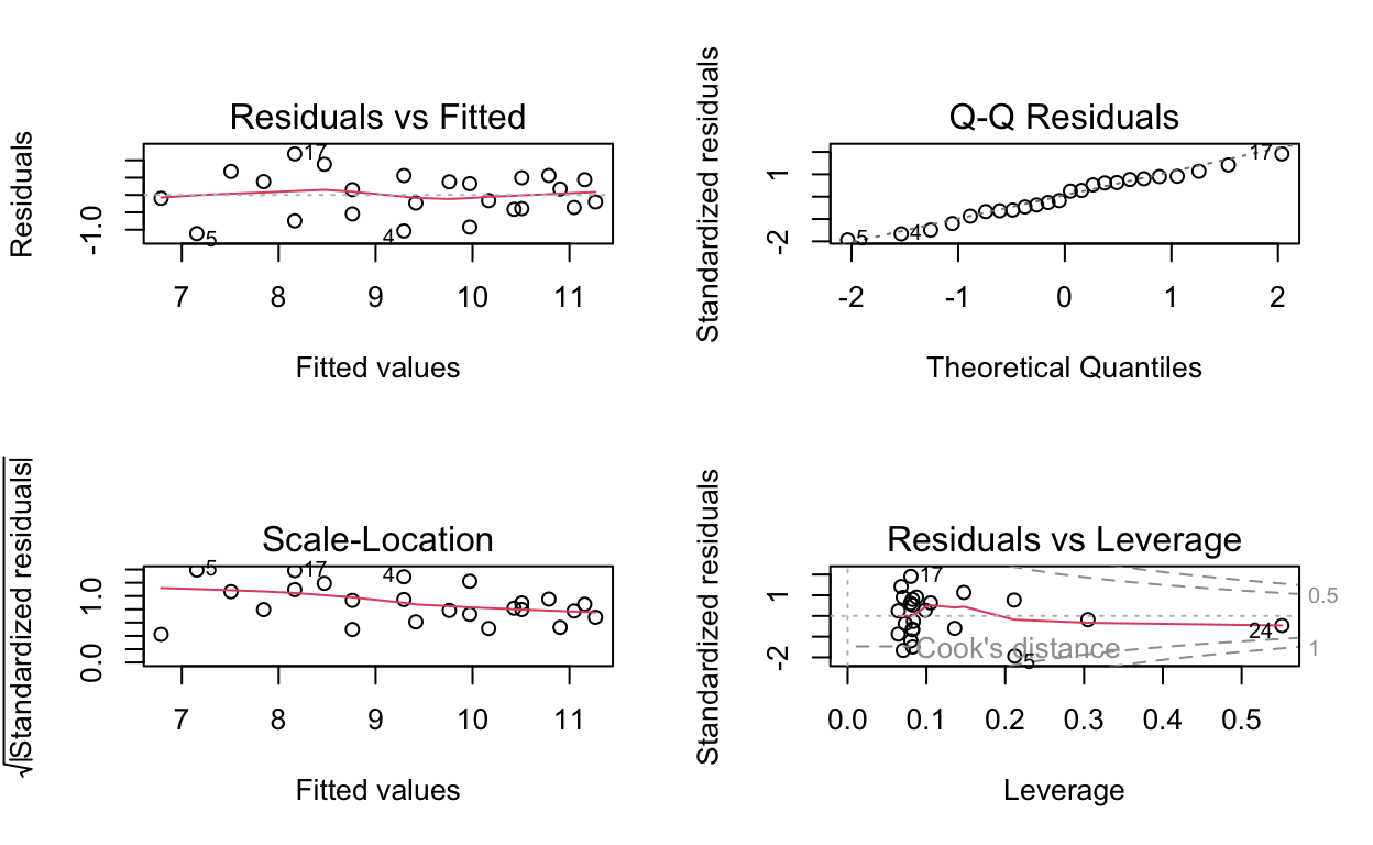
summary(mr_model)
Call:
lm(formula = Log_pop ~ Degree_days + I(Degree_days^2), data = df)

Residuals:
     Min       1Q   Median       3Q      Max
-1.11285 -0.39845  0.02889  0.45494  1.18598

Coefficients:
                      Estimate    Std. Error t value    Pr(>|t|)
(Intercept)       5.1568938178  0.6779132266   7.607 0.000000183 ***
Degree_days       0.0062744146  0.0014313209   4.384     0.00026 ***
I(Degree_days^2) -0.0000016089  0.0000006753  -2.383     0.02672 *
---
Signif. codes:  0 '***' 0.001 '**' 0.01 '*' 0.05 '.' 0.1 ' ' 1

Residual standard error: 0.647 on 21 degrees of freedom
Multiple R-squared:  0.8233,    Adjusted R-squared:  0.8065
F-statistic: 48.92 on 2 and 21 DF,  p-value: 0.00000001248
From the original paper, the \(R^2\) value of GS50a’s quadratic model was 0.82, we can see here that agrees: 0.82. In the original paper, \(P\) < 0.001, R reports \(p-value:\) 0.0002596, which also agrees.
Visualising the Model Fit to the Data
nema_long %>%
  group_by(Variety) %>%
  filter(Variety == "GS50a") %>%
  ggplot(aes(x = Degree_days,
             y = Log_pop,
             colour = Temperature,)) +
  geom_point(size = 3.5) +
  geom_smooth(
    method = "lm",
    formula = y ~ x + I(x ^ 2),
    size = 1,
    se = FALSE,
    colour = "grey",
    alpha = 0.5
  ) +
  ylab(expression(paste("ln(",
                        italic("P. thornei"),
                        "/kg soil) + 1"),
                  sep = "")) +
  xlab("Thermal Time (°C Days Above 10°C)") +
  theme_light() +
  theme(legend.position = "top") +
  guides(color = guide_colorbar(
    title.position = "top",
    title.hjust = .5,
    barwidth = unit(20, "lines"),
    barheight = unit(0.5, "lines")
  )) +
  scale_colour_viridis("Temperature (°C)") +
  coord_cartesian(clip = "off",
                  expand = FALSE) +
  ggtitle("GS50a Quadratic Model")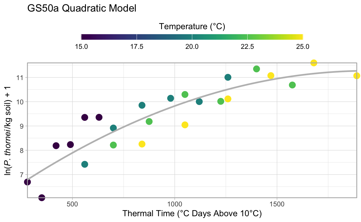
Discussion and Conclusions
As in the original paper, the model equations can be derived from these models as well. The derived regression equations are:
Gatcher (Susceptible): \[ln(P. thornei + 1) = -0.000003(0.0000009)T^2 + 0.009(0.0019)T + 5.4671(0.904)\]
GS50a (Moderately Resistant): \[ln(P. thornei + 1) = -0.000002(0.0000007)T^2 + 0.0063(0.0014)T + 5.1559(0.678)\]
Unplanted Control: \[ln(P. thornei + 1) = 0.0013(0.00018)T + 5.4151(0.193)\]
Refer back to the summary() outputs for each of the models for the coefficient values and \(R^2\) values, which match those reported in the original paper where the models were fit with Genstat.
Gatcher and GS50a have similar phenologies, but differ in resistance to root lesion nematodes, making the model comparisons a reasonable objective. The original paper goes on to test the effect of sowing date based on degree days. (Thompson 2015) reported a 61% increase in yield on average from sowing the susceptible, intolerant cultivar Gatcher at the end of May than sowing it in the third week of June. By June the soil temperatures and nematode populations were both greater, leading to lower wheat yield. The effects were less pronounced in the moderately resistant cultivar, GS50a, but were similar with a reduction in nematode population densities occurring due to earlier planting.
The models illustrated here for Gatcher and GS50a were able to accurately reflect the changes in nematode population as a result of degree days, which affected the nematodes’ ability to damage the crop and reduce yield (Thompson 2015).
Bonus Material
Exploring Why the Data Were Log Transformed
In the paper the the natural log, ln() +1, of the nematode population counts were used to fit the models.
Here we will explore a bit further why this was necessary.
A note about using log() + 1 rather than just log().
This is necessary with these data to avoid taking log(0).
Try it in R to see what happens if you are not familiar.
First, plot the data for each of the four temperatures and the four varieties, plus the unplanted control converting from the natural log value back to the original actual count values to see what the population numbers look like.
Note the use of exp() - 1 in the y aesthetic, to transform the values from the ln() + 1 values.
Doing this shows us the original data’s values and helps demonstrate why the data were log transformed for analysis.
To examine the data, first we will use boxplots and then quantile-quantile (qq) plots.
ggplot(nema_long,
       aes(
         x = Temperature,
         y = exp(Log_pop) - 1,
         group = Temperature
       )) +
  geom_boxplot(colour = "grey",
               outlier.color = NA) +
  geom_jitter(width = 0.1,
              alpha = 0.6) +
  ylab(expression(paste(
    "exp(ln(",
    italic("P. thornei"),
    "/kg soil) + 1)"
  ),
  sep = "")) +
  facet_wrap(~ Variety,
             ncol = 2) +
  ggtitle("Untransformed Data") +
  coord_cartesian(clip = "off",
                  expand = FALSE) +
  theme_light()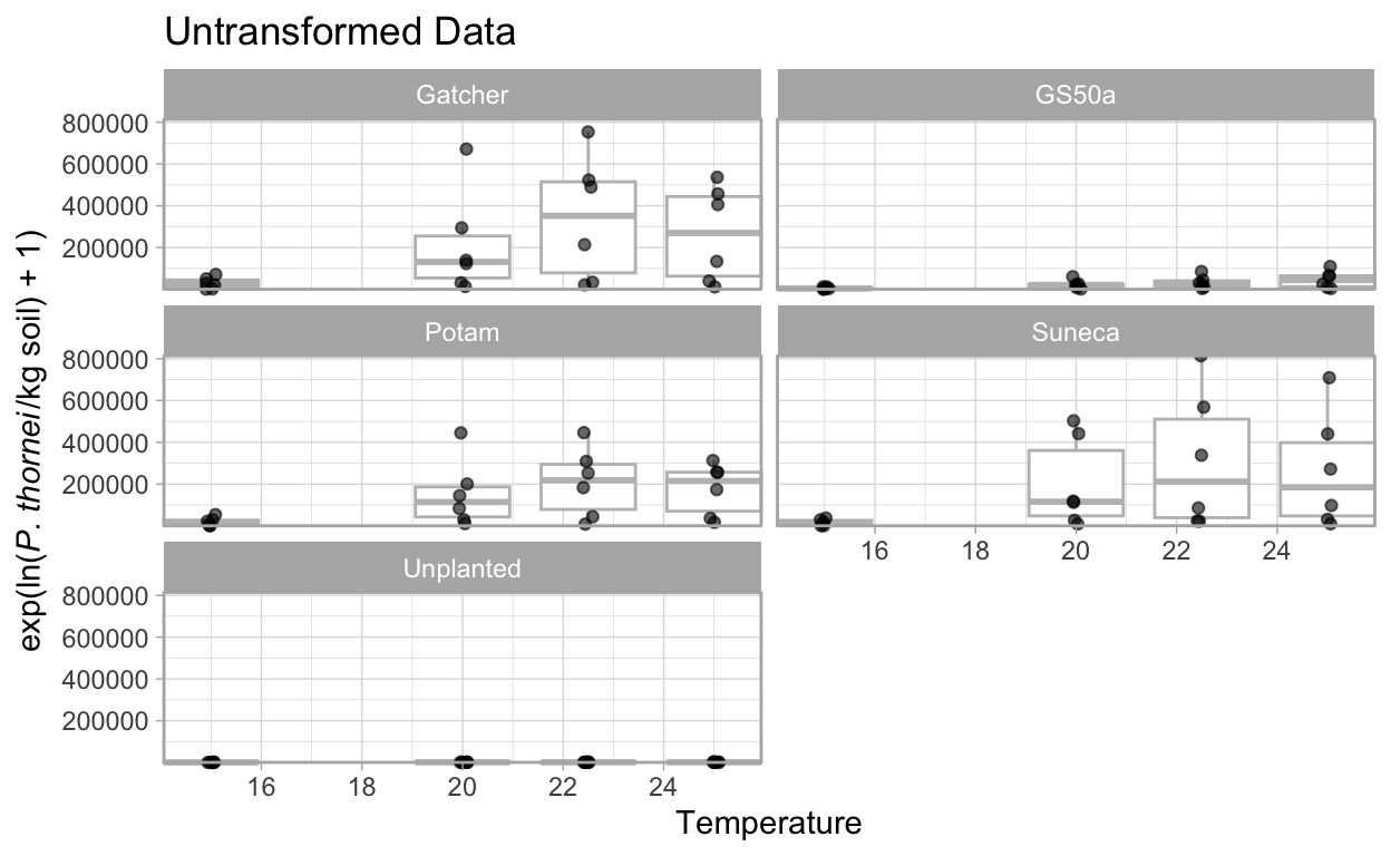
ggplot(nema_long,
       aes(sample = exp(Log_pop) - 1)) +
  stat_qq() +
  facet_wrap( ~ Variety,
              ncol = 2) +
  coord_cartesian(clip = "off",
                  expand = FALSE) +
  theme_light()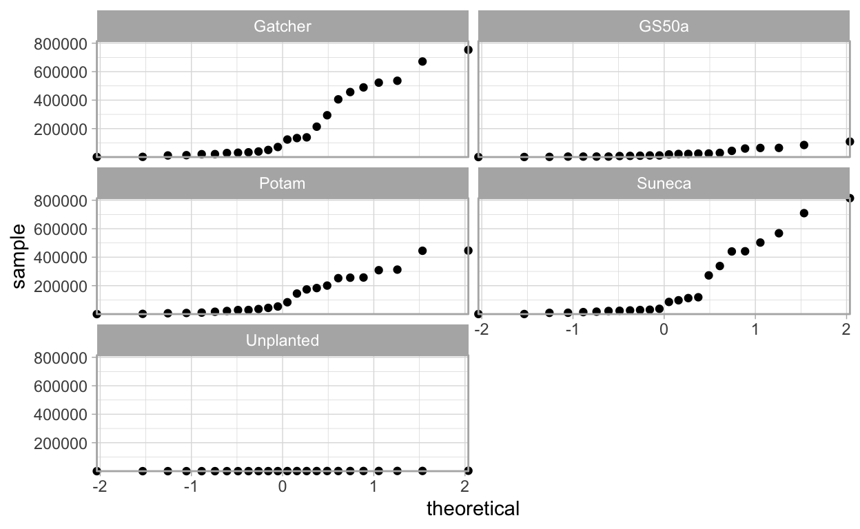
The boxplots show that there is a wide range of values with the 25 °C temperature populations close to zero with others having quite large ranges, this could indicate heteroscedasticity.
Also, looking at the qq-plots it is apparent that the original data do not meet the assumptions of normally distributed errors for a linear model. See the Further Reading section for suggested reading on interpreting qq-plots.
ggplot(nema_long,
       aes(x = Temperature,
           y = Log_pop,
           group = Temperature)) +
  geom_boxplot(colour = "grey",
               outlier.color = NA) +
  geom_jitter(width = 0.1,
              alpha = 0.6) +
  ylab(expression(paste(
    "exp(ln(",
    italic("P. thornei"),
    "/kg soil) + 1)"
  ),
  sep = "")) +
  facet_wrap(~ Variety,
             ncol = 2) +
  ggtitle("Log Transformed Data") +
  coord_cartesian(clip = "off",
                  expand = FALSE) +
  theme_light()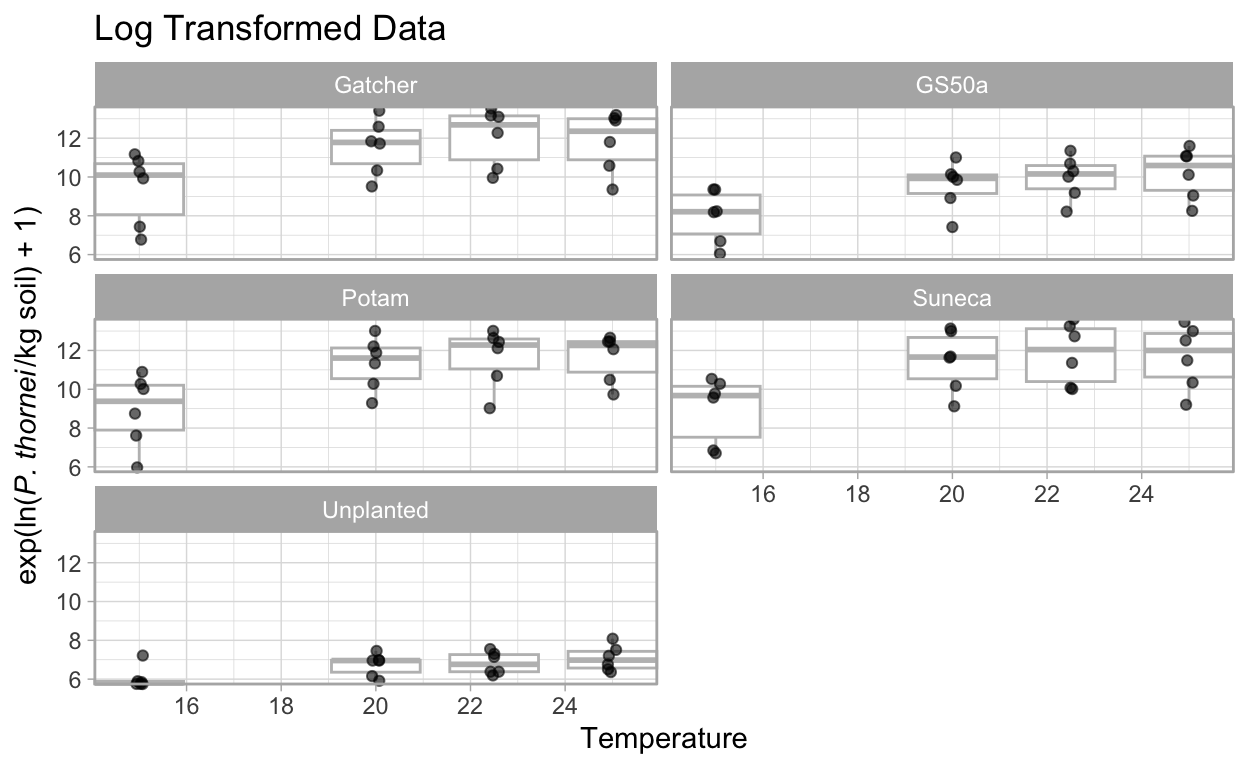
ggplot(nema_long,
       aes(sample = Log_pop)) +
  stat_qq() +
  facet_wrap(~ Variety,
             ncol = 2) +
  coord_cartesian(clip = "off",
                  expand = FALSE) +
  theme_light()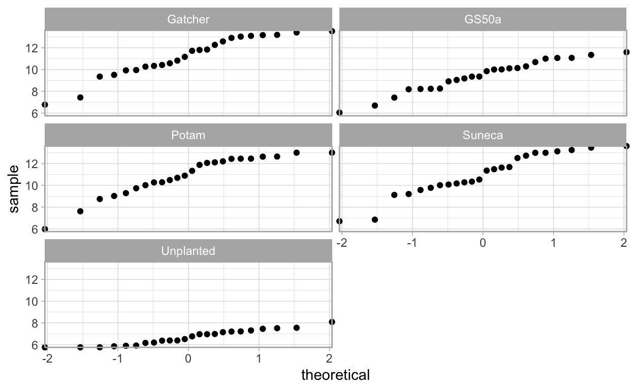
Here we see that the log() transformed data’s boxplots show fewer outliers and tighter range of values.
The qq-plots also indicate that it is possible to conduct a linear regression with these data.
Using AIC to Compare Model Quality
Even though the original paper used a linear model for the unplanted data, a polynomial model also fits these data quite well. We can compare the original linear model from the paper with a polynomial model quite easily in R to see how the models compare using AIC (Akaike information criterion). AIC is used to measure the models’ relative quality to each other.
Since the unplanted_model object already exists as a product of the linear model, we simply need to use the polynomial model with the unplanted data to create a new object to compare them.
unplanted_poly_model <- nema_long %>%
  filter(Variety == "Unplanted") %>%
  quadratic_model()

par(mfrow = c(2, 2))
plot(unplanted_poly_model)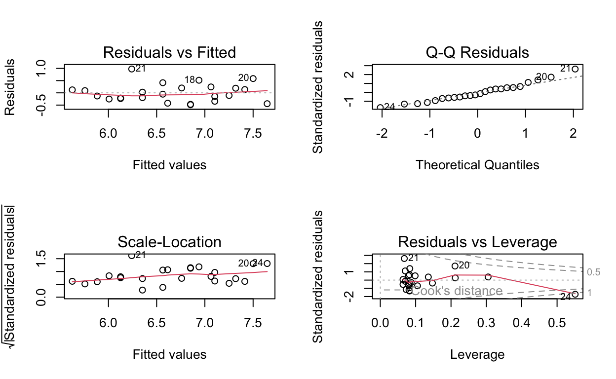
summary(unplanted_poly_model)
Call:
lm(formula = Log_pop ~ Degree_days + I(Degree_days^2), data = df)

Residuals:
     Min       1Q   Median       3Q      Max
-0.48697 -0.23865 -0.08038  0.19211  0.97466

Coefficients:
                      Estimate    Std. Error t value        Pr(>|t|)
(Intercept)       5.0616148511  0.4031249658  12.556 0.0000000000314
Degree_days       0.0021252138  0.0008511431   2.497          0.0209
I(Degree_days^2) -0.0000004010  0.0000004016  -0.999          0.3293

(Intercept)      ***
Degree_days      *
I(Degree_days^2)
---
Signif. codes:  0 '***' 0.001 '**' 0.01 '*' 0.05 '.' 0.1 ' ' 1

Residual standard error: 0.3848 on 21 degrees of freedom
Multiple R-squared:  0.7101,    Adjusted R-squared:  0.6825
F-statistic: 25.72 on 2 and 21 DF,  p-value: 0.000002255
By this information, the \(R^2\) value is a bit better from the unplanted_poly_model, 0.7101253, than the original unplanted_model’s, 0.6963592.
Using the same code from above it is easy to visualise the new model’s fit using {ggplot2}.
nema_long %>%
  group_by(Variety) %>%
  filter(Variety == "Unplanted") %>%
  ggplot(aes(x = Degree_days,
             y = Log_pop,
             colour = Temperature,)) +
  geom_point(size = 3.5) +
  geom_smooth(
    method = "lm",
    formula = y ~ x + I(x ^ 2),
    size = 1,
    se = FALSE,
    colour = "grey",
    alpha = 0.5
  ) +
  ylab(expression(paste("ln(",
                        italic("P. thornei"),
                        "/kg soil) + 1"),
                  sep = "")) +
  xlab("Thermal Time (°C Days Above 10°C)") +
  theme_light() +
  theme(legend.position = "top") +
  guides(color = guide_colorbar(
    title.position = "top",
    title.hjust = 0.5,
    barwidth = unit(20, "lines"),
    barheight = unit(0.5, "lines")
  )) +
  coord_cartesian(clip = "off",
                  expand = FALSE) +
  scale_colour_viridis("Temperature (°C)") +
  ggtitle("Unplanted Quadratic Model")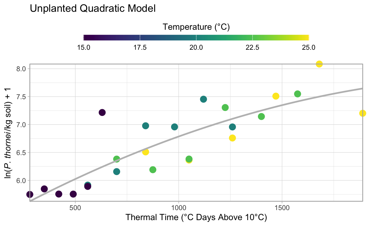
Checking the model fit visually, we can see that it fits the data nicely. To get a better feel for how these models compare, AIC can be used to determine the relative quality of a model for a given set of data. That is, you cannot compare models for other data using AIC.
Checking the AIC is quite simple in R, just AIC().
Here we check the AIC of the original linear unplanted_model and the new unplanted_poly_model.
Ideally when fitting models, you look for the least complex model that provides the best explanation of the variation in the data. In this case the original linear model has a lower AIC, 26.1714857, than that of the polynomial model, 27.0579669, but they are extremely close and the \(R^2\) value of the polynomial model, 0.7101253, is a bit better than the linear model’s \(R^2\), 0.6963592, as well. Therefore, without more data to distinguish the models it appears that either model suffices for the data provided.
Further Reading
Tidy Data
Wickham (2014) introduced the idea of tidy data for analysis. As you work with raw data from many sources, it is useful to understand what this means and why it is useful. In this example, {tidyr} was used to convert the data from wide to long format. For a more in-depth look at using {tidyr} see:
Interpreting Linear Models in R
The University of Georgia has a nice, easy to understand set of materials that demonstrate how to interpret diagnostic plot outputs from plot(lm.object), Regression diagnostic plots on their Data Analysis in the Geosciences page.
For even more, this Cross Validated question has an excellent discussion on Interpreting plot.lm().
The University of Montana provides an on-line text, “Statistics With R”, that includes a section on ANOVA model diagnostics including QQ-plots.
Since ANOVA uses lm() in R, the tools and descriptions here are applicable to the qq-plots we have generated here in this illustration.
For a detailed look at how to interpret the output from summary() for linear models, see The YHAT Blog post, Fitting & Interpreting Linear Models in R.
Faraway (2002), “Practical Regression and Anova using R” is an excellent free resource that goes into detail about fitting linear models using R and how to interpret the diagnostics. Prof. Faraway has more recent books on the subject as well that you might wish to borrow from your library or purchase, see http://www.maths.bath.ac.uk/~jjf23/LMR/ for more details.
Selecting the Right Colour Scheme
Selecting good colour schemes is essential for communicating your message. The {viridis} package makes this much easier to do. Bob Rudis has a nice blog post when the package was first introduced that demonstrates why it is useful to use a package like this for your colour palettes, Using the new ‘viridis’ colormap in R (thanks to Simon Garnier). Other colour palettes for R exist as well. Notably the RColorBrewer package provides an easy-to-use interface for the fantastic Color Brewer palettes http://colorbrewer2.org/ commonly used for cartography but also useful for graphs.
A Note on This Article
This article was original published in 2018 on Open Plant Pathology shortly after we launched. Since then it has been updated with minor changes to the R code to bring it up-to-date with the latest libraries and present cleaner figures and integrate into the new website framework that OPP now uses. Changes since the original can be viewed using the link below that compares the original article with this version. The message and scientific contents remain the same.
AHS, 2021.08.04
Reproducibility
─ Session info ─────────────────────────────────────────────────────
 setting  value
 version  R version 4.3.2 (2023-10-31)
 os       macOS Sonoma 14.3
 system   aarch64, darwin20
 ui       X11
 language (EN)
 collate  en_US.UTF-8
 ctype    en_US.UTF-8
 tz       Australia/Perth
 date     2024-01-29
 pandoc   3.1.11.1 @ /opt/homebrew/bin/ (via rmarkdown)

─ Packages ─────────────────────────────────────────────────────────
 ! package     * version date (UTC) lib source
 P bit           4.0.5   2022-11-15 [?] CRAN (R 4.3.0)
 P bit64         4.0.5   2020-08-30 [?] CRAN (R 4.3.0)
 P bslib         0.6.1   2023-11-28 [?] CRAN (R 4.3.1)
 P cachem        1.0.8   2023-05-01 [?] CRAN (R 4.3.0)
 P cli           3.6.2   2023-12-11 [?] CRAN (R 4.3.1)
 P colorspace    2.1-0   2023-01-23 [?] CRAN (R 4.3.0)
 P crayon        1.5.2   2022-09-29 [?] CRAN (R 4.3.0)
 P digest        0.6.34  2024-01-11 [?] CRAN (R 4.3.1)
 P distill       1.6     2023-10-06 [?] CRAN (R 4.3.1)
 P downlit       0.4.3   2023-06-29 [?] CRAN (R 4.3.0)
 P dplyr       * 1.1.4   2023-11-17 [?] CRAN (R 4.3.1)
 P evaluate      0.23    2023-11-01 [?] CRAN (R 4.3.1)
 P fansi         1.0.6   2023-12-08 [?] CRAN (R 4.3.1)
 P farver        2.1.1   2022-07-06 [?] CRAN (R 4.3.0)
 P fastmap       1.1.1   2023-02-24 [?] CRAN (R 4.3.0)
 P forcats     * 1.0.0   2023-01-29 [?] CRAN (R 4.3.0)
 P generics      0.1.3   2022-07-05 [?] CRAN (R 4.3.0)
 P ggplot2     * 3.4.4   2023-10-12 [?] CRAN (R 4.3.1)
 P glue          1.7.0   2024-01-09 [?] CRAN (R 4.3.1)
 P gridExtra     2.3     2017-09-09 [?] CRAN (R 4.3.0)
 P gtable        0.3.4   2023-08-21 [?] CRAN (R 4.3.0)
 P highr         0.10    2022-12-22 [?] CRAN (R 4.3.0)
 P hms           1.1.3   2023-03-21 [?] CRAN (R 4.3.0)
 P htmltools     0.5.7   2023-11-03 [?] CRAN (R 4.3.1)
 P jquerylib     0.1.4   2021-04-26 [?] CRAN (R 4.3.0)
 P jsonlite      1.8.8   2023-12-04 [?] CRAN (R 4.3.1)
 P kableExtra  * 1.4.0   2024-01-24 [?] CRAN (R 4.3.1)
 P knitr         1.45    2023-10-30 [?] CRAN (R 4.3.1)
 P labeling      0.4.3   2023-08-29 [?] CRAN (R 4.3.0)
 P lattice       0.22-5  2023-10-24 [?] CRAN (R 4.3.1)
 P lifecycle     1.0.4   2023-11-07 [?] CRAN (R 4.3.1)
 P lubridate   * 1.9.3   2023-09-27 [?] CRAN (R 4.3.1)
 P magrittr      2.0.3   2022-03-30 [?] CRAN (R 4.3.0)
 P Matrix        1.6-5   2024-01-11 [?] CRAN (R 4.3.1)
 P memoise       2.0.1   2021-11-26 [?] CRAN (R 4.3.0)
 P mgcv          1.9-1   2023-12-21 [?] CRAN (R 4.3.1)
 P munsell       0.5.0   2018-06-12 [?] CRAN (R 4.3.0)
 P nlme          3.1-164 2023-11-27 [?] CRAN (R 4.3.1)
 P pillar        1.9.0   2023-03-22 [?] CRAN (R 4.3.0)
 P pkgconfig     2.0.3   2019-09-22 [?] CRAN (R 4.3.0)
 P purrr       * 1.0.2   2023-08-10 [?] CRAN (R 4.3.0)
 P R6            2.5.1   2021-08-19 [?] CRAN (R 4.3.0)
 P readr       * 2.1.5   2024-01-10 [?] CRAN (R 4.3.1)
 P rlang         1.1.3   2024-01-10 [?] CRAN (R 4.3.1)
 P rmarkdown     2.25    2023-09-18 [?] CRAN (R 4.3.1)
 P rstudioapi    0.15.0  2023-07-07 [?] CRAN (R 4.3.0)
 P sass          0.4.8   2023-12-06 [?] CRAN (R 4.3.1)
 P scales        1.3.0   2023-11-28 [?] CRAN (R 4.3.1)
 P sessioninfo   1.2.2   2021-12-06 [?] CRAN (R 4.3.0)
 P stringi       1.8.3   2023-12-11 [?] CRAN (R 4.3.1)
 P stringr     * 1.5.1   2023-11-14 [?] CRAN (R 4.3.1)
 P svglite       2.1.3   2023-12-08 [?] CRAN (R 4.3.1)
 P systemfonts   1.0.5   2023-10-09 [?] CRAN (R 4.3.1)
 P tibble      * 3.2.1   2023-03-20 [?] CRAN (R 4.3.0)
 P tidyr       * 1.3.1   2024-01-24 [?] CRAN (R 4.3.1)
 P tidyselect    1.2.0   2022-10-10 [?] CRAN (R 4.3.0)
 P tidyverse   * 2.0.0   2023-02-22 [?] CRAN (R 4.3.0)
 P timechange    0.3.0   2024-01-18 [?] CRAN (R 4.3.1)
 P tzdb          0.4.0   2023-05-12 [?] CRAN (R 4.3.0)
 P utf8          1.2.4   2023-10-22 [?] CRAN (R 4.3.1)
 P vctrs         0.6.5   2023-12-01 [?] CRAN (R 4.3.1)
 P viridis     * 0.6.4   2023-07-22 [?] CRAN (R 4.3.0)
 P viridisLite * 0.4.2   2023-05-02 [?] CRAN (R 4.3.0)
 P vroom         1.6.5   2023-12-05 [?] CRAN (R 4.3.1)
 P withr         3.0.0   2024-01-16 [?] CRAN (R 4.3.1)
 P xfun          0.41    2023-11-01 [?] CRAN (R 4.3.1)
 P xml2          1.3.6   2023-12-04 [?] CRAN (R 4.3.1)
 P yaml          2.3.8   2023-12-11 [?] CRAN (R 4.3.1)

 [1] /Users/283204f/Developer/GitHub/OpenPlantPathology/OpenPlantPathology/renv/library/R-4.3/aarch64-apple-darwin20
 [2] /Users/283204f/Library/Caches/org.R-project.R/R/renv/sandbox/R-4.3/aarch64-apple-darwin20/ac5c2659
 [3] /Library/Frameworks/R.framework/Versions/4.3-arm64/Resources/library

 P ── Loaded and on-disk path mismatch.

────────────────────────────────────────────────────────────────────